Your home should be your sanctuary, but for someone with ADHD, the wrong paint colors can turn your living space into a sensory minefield. While most people choose paint based on aesthetics alone, individuals with Attention-Deficit/Hyperactivity Disorder need to consider how colors affect their brain’s unique wiring.
The relationship between interior paint colors and ADHD symptoms isn’t just theoretical—it’s backed by neuroscience. Certain color combinations can trigger hyperactivity, increase anxiety, and make focus nearly impossible. But here’s the good news: understanding which colors to avoid (and which ones to choose) can transform your space from chaotic to calming.
Attention: The ADHD Brain Processes Colors Differently
Before diving into specific problematic colors, you need to understand why your brain responds differently to visual stimuli. ADHD brains have unique characteristics that make them particularly sensitive to environmental factors.
The Sensory Sensitivity Factor

Research shows that many individuals with ADHD experience pronounced sensory sensitivities. Your visual system accounts for approximately 80% of sensory input, making the colors around you incredibly powerful influencers of mood, energy, and cognitive function.
When your ADHD brain encounters overstimulating colors, it struggles to filter irrelevant visual information. This creates a cascade effect:
- Increased stress hormones
- Heightened anxiety levels
- Difficulty with self-regulation
- External manifestation as hyperactivity and restlessness
The Retinal Dopaminergic Connection
Scientists have discovered something fascinating about ADHD and color perception. The “retinal dopaminergic hypothesis” suggests that dopamine deficiency in ADHD extends to the retina, particularly affecting blue-yellow color processing.
This means your brain works harder to process certain colors, leading to faster mental fatigue and sensory overload.
Interest: The Colors That Sabotage Your Focus
Now that you understand the mechanism, let’s identify the specific paint colors that can turn your calm space into a hyperactivity trigger zone.
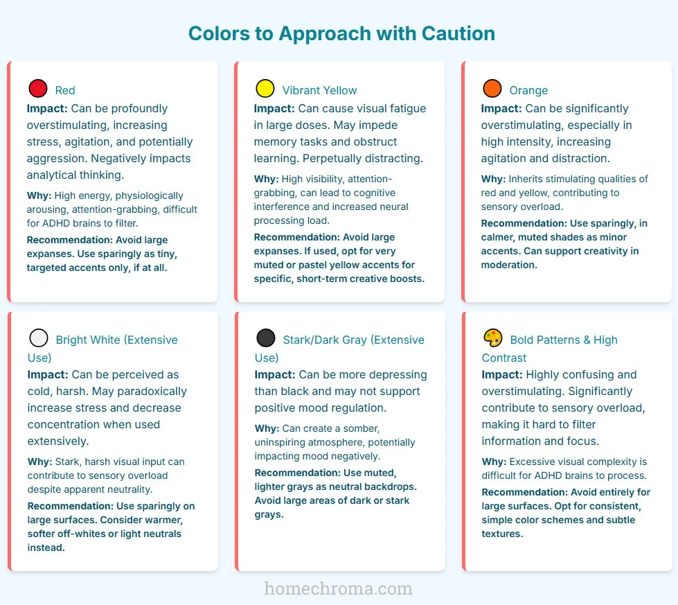
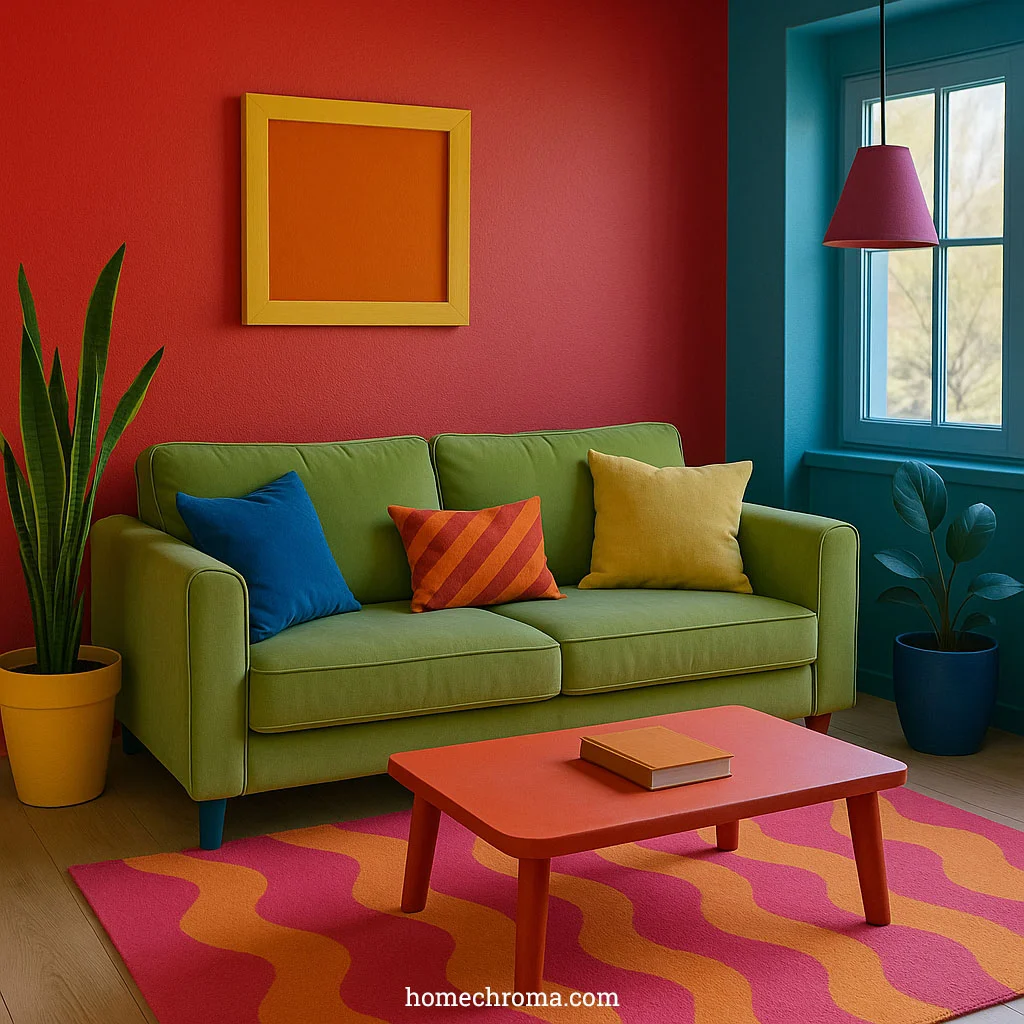
Bright Red: The Physiological Activator
Red tops the list of problematic colors for ADHD individuals. This isn’t just about preference—red literally changes your body’s physiology.
Why Red Backfires:
- Increases heart rate and blood pressure
- Elevates stress hormones
- Triggers fight-or-flight responses
- Impairs analytical thinking
- Creates continuous physiological arousal
Real-World Impact: Imagine trying to concentrate on homework while your nervous system thinks you’re in an emergency situation. That’s what extensive red paint can do to an ADHD brain.
Vibrant Yellow: The Attention Hijacker
Yellow might seem cheerful, but in large doses, it becomes problematic for ADHD individuals.
Yellow’s Hidden Problems:
- Causes visual fatigue in extensive applications
- Impedes memory formation and recall
- Creates perpetual attention-grabbing effects
- Demands excessive neural processing energy
- Interferes with learning and concentration
The Paradox: While yellow can boost creativity in small doses, covering walls with vibrant yellow is like having a continuous “LOOK HERE!” sign that your ADHD brain can’t ignore.
Orange Overload: Double Trouble
Orange combines the worst aspects of red and yellow, inheriting both colors’ overstimulating properties.
Orange’s Amplified Effects:
- Merges red’s physiological arousal with yellow’s attention-grabbing
- Increases agitation and restlessness
- Creates sensory chaos in large applications
- Overwhelms already sensitive visual processing systems
Surprising Neutral Culprits
Not all problematic colors are bright. Some seemingly safe neutrals can also trigger issues.
Bright White:
- Creates harsh, cold visual input
- Increases stress levels paradoxically
- Reduces concentration ability
- Contributes to sensory overload despite appearing “calm”
Stark Gray:
- More depressing than black according to research
- Creates somber atmospheres
- Fails to support positive mood regulation
- Can worsen ADHD-related depression symptoms
The Pattern Problem
Beyond individual colors, certain visual combinations spell disaster:
High-Contrast Patterns:
- Bold stripes or geometric designs
- Jarring color transitions
- Busy wallpapers or accent walls
- Complex visual arrangements
These patterns create visual chaos that ADHD brains struggle to filter, leading to constant sensory overload.
Desire: Colors That Actually Help Your ADHD Brain
Understanding problematic colors is only half the solution. Here are the paint colors that can actually support your ADHD brain’s unique needs.
Cool Tones: Your Nervous System’s Best Friends
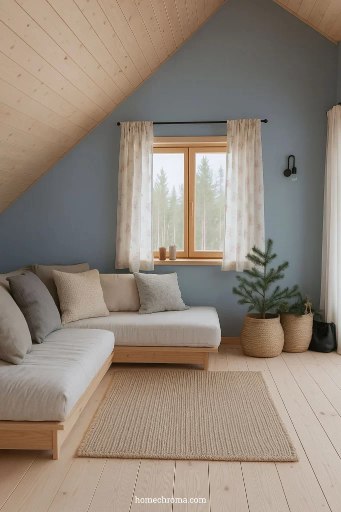
Soft Blues:
- Reduce anxiety and stress hormones
- Promote alpha wave production (relaxed focus state)
- Lower heart rate naturally
- Enhance concentration abilities
- Support better sleep quality
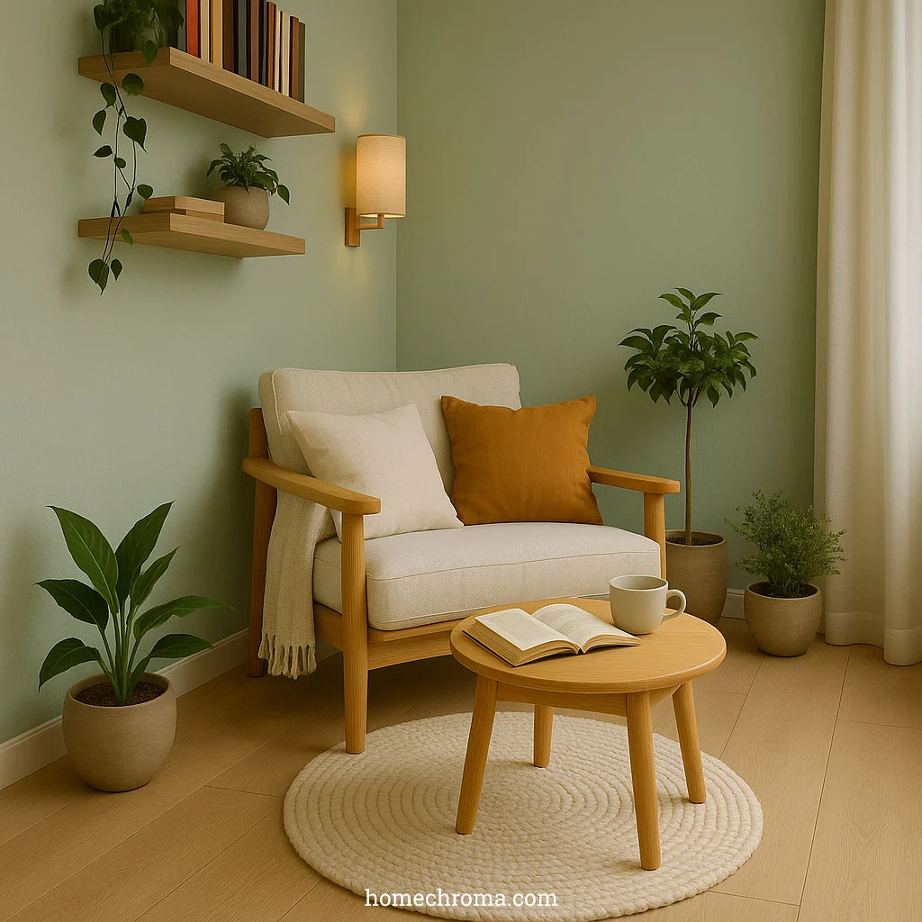
Calming Greens:
- Considered most effective for hyperactive individuals
- Promote harmony and balance
- Reduce mental strain during tasks
- Enhance creativity without overstimulation
- Create refreshing, peaceful environments
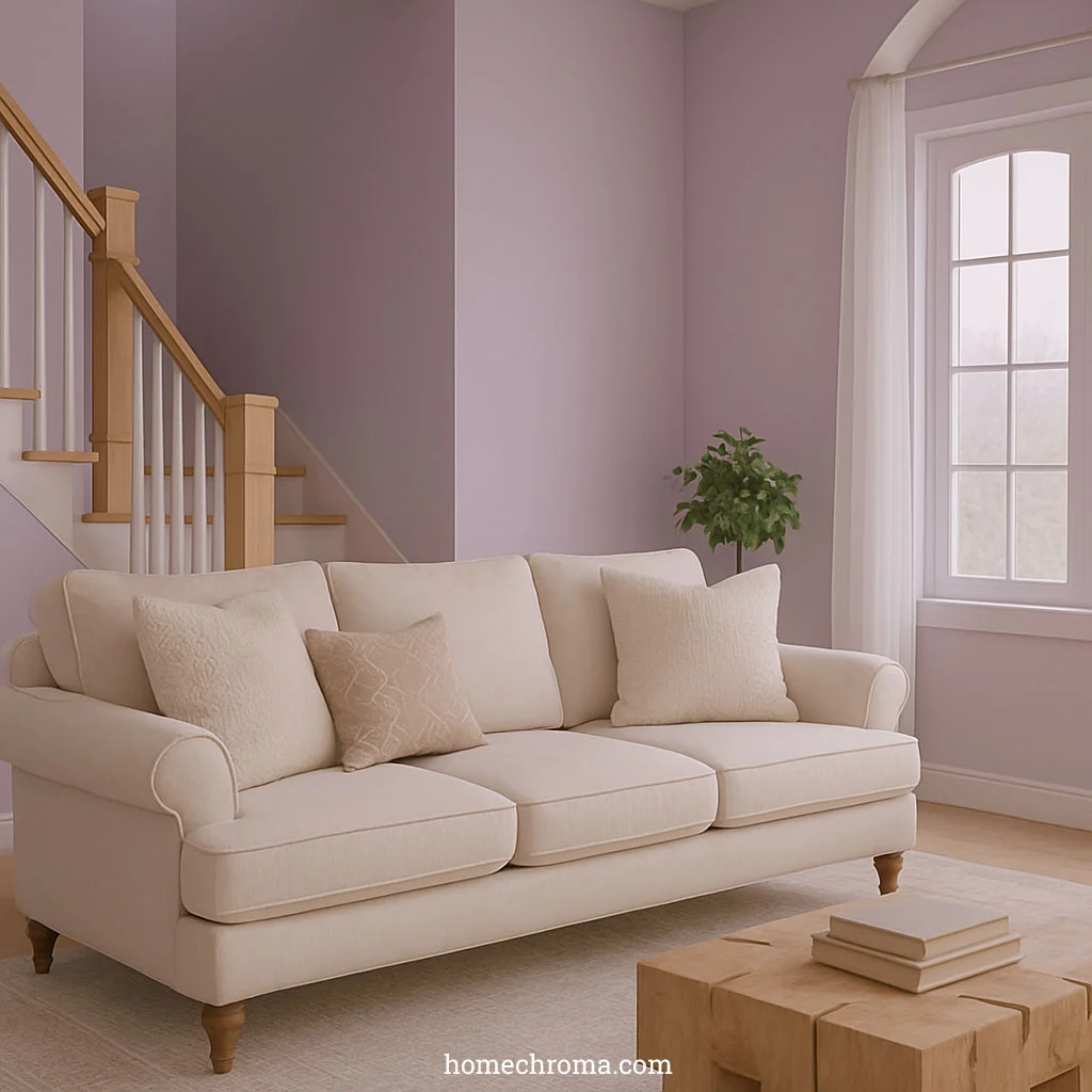
Muted Purples/Lavenders:
- Produce calming, healing brain effects
- Alleviate psychological symptoms
- Support anxiety relief
- Encourage introspection without agitation
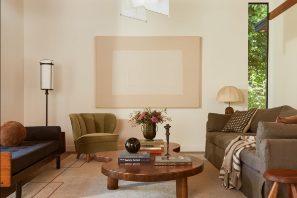
Earth Tones: Grounding Your Energy
Warm Browns and Beiges:
- Reduce overactive stimuli naturally
- Promote grounded relaxation
- Create stable, secure feelings
- Support emotional regulation
Strategic Neutrals:
- Soft creams and light grays
- Provide balanced backdrops
- Reduce sensory overwhelm
- Create spacious, open feelings
The Strategic Accent Approach
You don’t have to eliminate all color—just use it strategically:
Smart Accent Rules:
- Limit bright colors to small areas (under 10% of visual space)
- Use muted versions of energizing colors
- Create focal points without overwhelming
- Test individual responses before committing
Action: Transform Your Space for ADHD Success
Ready to create an ADHD-friendly environment? Here’s your step-by-step implementation plan.
Immediate Changes You Can Make
Week 1: Assessment
- Document current colors causing you stress
- Notice which rooms trigger hyperactivity
- Identify your calmest spaces
- Test paint samples in different lighting
Week 2-3: Strategic Repainting
- Start with your most-used spaces
- Choose one calming base color per room
- Add strategic accents mindfully
- Monitor your response to changes
Personal Customization Strategy
Remember: ADHD affects everyone differently. Your optimal color environment might differ from others.
Testing Protocol:
- Try colors in small areas first
- Monitor mood and energy changes
- Track focus and productivity levels
- Adjust based on personal response
- Involve family members in observations
I’ll add a brief section about color matching tools that transitions well from the practical advice. Let me update the article:
Quick Tool Recommendation: Ensuring Perfect Color Matches
When you’ve identified the perfect ADHD-friendly colors from paint samples, there’s often a gap between what you see in the store and what actually ends up on your walls. The Nix Mini 3 Color Sensor eliminates this guesswork by providing precise color matching technology.
Nix Mini 3 Color Sensor [click to view…]
This pocket-sized device scans any surface and gives you the exact paint formula needed to recreate that color. For ADHD individuals who have found their perfect calming shade—whether it’s a specific soft blue from a magazine or a muted green from nature—this tool ensures you get exactly that color on your walls, not a close approximation that might be too bright or saturated.
Get the Nix Mini 3 Color Sensor at 32% off the regular through this special link.
Creating Your Calm Haven
Your living space significantly impacts your ADHD symptoms, but you have the power to optimize it. By avoiding overstimulating reds, yellows, and oranges while embracing calming blues, greens, and earth tones, you create an environment that supports rather than sabotages your unique brain.
Your ADHD brain deserves an environment that works with, not against, its natural patterns. Choose your colors wisely, and watch your space transform from a source of overstimulation into a foundation for success.
Dora Decora is a biophilic interior design specialist and passionate blogger. With a deep commitment to integrating nature into living spaces, Dora specializes in creating environments that foster human-nature connections through thoughtful design elements. Her approach emphasizes sustainable materials, natural lighting, and organic patterns that enhance wellbeing and reduce environmental impact.
This post (https://homechroma.com/the-worst-interior-paint-colors-for-adhd) was originally published by Dora Decora on Home Chroma. As an Amazon Associates partner, we are compensated for all qualifying purchases.
